> ## Documentation Index
> Fetch the complete documentation index at: https://wiki.another-horizon.eu/llms.txt
> Use this file to discover all available pages before exploring further.

# 磁贴

> 在网格布局中展示包含标题和说明的视觉预览。

使用磁贴来创建带有图案背景、标题和说明的视觉展示元素。磁贴非常适合在网格布局中展示组件预览、功能亮点或导航项。

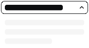
<Tile href="/zh/components/accordions" title="折叠面板" description="两种变体">
  <img src="https://mintcdn.com/anotherhorizon/c56XyBFaIRu-DtQw/images/tiles/accordion-light.svg?fit=max&auto=format&n=c56XyBFaIRu-DtQw&q=85&s=71a371308e84711a7a709ef7ef2bdbf6" alt="折叠面板组件预览" className="block dark:hidden" width="184" height="100" data-path="images/tiles/accordion-light.svg" />

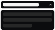
  <img src="https://mintcdn.com/anotherhorizon/c56XyBFaIRu-DtQw/images/tiles/accordion-dark.svg?fit=max&auto=format&n=c56XyBFaIRu-DtQw&q=85&s=8a7c551d3c533ab03f962ef1c652fed2" alt="折叠面板组件预览（深色模式）" className="hidden dark:block" width="184" height="100" data-path="images/tiles/accordion-dark.svg" />
</Tile>

```mdx Tile example theme={null}
<Tile href="/components/accordions" title="折叠面板" description="两种变体">
  <img src="/images/tiles/accordion-light.svg" alt="折叠面板组件预览" className="block dark:hidden" />
  <img src="/images/tiles/accordion-dark.svg" alt="折叠面板组件预览(深色模式)" className="hidden dark:block" />
</Tile>
```

<div id="grid-layout">
  ## 网格布局
</div>

将卡片与 [Columns 组件](/zh/components/columns) 组合使用，以创建响应式预览网格。

<Columns cols={3}>
  <Tile href="/zh/components/accordions" title="Accordion" description="两种样式">
    <img src="https://mintcdn.com/anotherhorizon/c56XyBFaIRu-DtQw/images/tiles/accordion-light.svg?fit=max&auto=format&n=c56XyBFaIRu-DtQw&q=85&s=71a371308e84711a7a709ef7ef2bdbf6" alt="Accordion 组件预览" className="block dark:hidden" width="184" height="100" data-path="images/tiles/accordion-light.svg" />

    <img src="https://mintcdn.com/anotherhorizon/c56XyBFaIRu-DtQw/images/tiles/accordion-dark.svg?fit=max&auto=format&n=c56XyBFaIRu-DtQw&q=85&s=8a7c551d3c533ab03f962ef1c652fed2" alt="Accordion 组件预览（深色模式）" className="hidden dark:block" width="184" height="100" data-path="images/tiles/accordion-dark.svg" />
  </Tile>

  <Tile href="/zh/components/accordions" title="Accordion" description="两种样式">
    <img src="https://mintcdn.com/anotherhorizon/c56XyBFaIRu-DtQw/images/tiles/accordion-light.svg?fit=max&auto=format&n=c56XyBFaIRu-DtQw&q=85&s=71a371308e84711a7a709ef7ef2bdbf6" alt="Accordion 组件预览" className="block dark:hidden" width="184" height="100" data-path="images/tiles/accordion-light.svg" />

    <img src="https://mintcdn.com/anotherhorizon/c56XyBFaIRu-DtQw/images/tiles/accordion-dark.svg?fit=max&auto=format&n=c56XyBFaIRu-DtQw&q=85&s=8a7c551d3c533ab03f962ef1c652fed2" alt="Accordion 组件预览（深色模式）" className="hidden dark:block" width="184" height="100" data-path="images/tiles/accordion-dark.svg" />
  </Tile>

  <Tile href="/zh/components/accordions" title="Accordion" description="两种样式">
    <img src="https://mintcdn.com/anotherhorizon/c56XyBFaIRu-DtQw/images/tiles/accordion-light.svg?fit=max&auto=format&n=c56XyBFaIRu-DtQw&q=85&s=71a371308e84711a7a709ef7ef2bdbf6" alt="Accordion 组件预览" className="block dark:hidden" width="184" height="100" data-path="images/tiles/accordion-light.svg" />

    <img src="https://mintcdn.com/anotherhorizon/c56XyBFaIRu-DtQw/images/tiles/accordion-dark.svg?fit=max&auto=format&n=c56XyBFaIRu-DtQw&q=85&s=8a7c551d3c533ab03f962ef1c652fed2" alt="Accordion 组件预览（深色模式）" className="hidden dark:block" width="184" height="100" data-path="images/tiles/accordion-dark.svg" />
  </Tile>
</Columns>

```mdx Grid layout example theme={null}
<Columns cols={3}>
  <Tile href="/components/accordions" title="折叠面板" description="两种样式">
    <img src="/images/tiles/accordion-light.svg" alt="折叠面板组件预览" className="block dark:hidden" />
    <img src="/images/tiles/accordion-dark.svg" alt="折叠面板组件预览（深色模式）" className="hidden dark:block" />
  </Tile>
  <Tile href="/components/accordions" title="折叠面板" description="两种样式">
    <img src="/images/tiles/accordion-light.svg" alt="折叠面板组件预览" className="block dark:hidden" />
    <img src="/images/tiles/accordion-dark.svg" alt="折叠面板组件预览（深色模式）" className="hidden dark:block" />
  </Tile>
  <Tile href="/components/accordions" title="折叠面板" description="两种样式">
    <img src="/images/tiles/accordion-light.svg" alt="折叠面板组件预览" className="block dark:hidden" />
    <img src="/images/tiles/accordion-dark.svg" alt="折叠面板组件预览（深色模式）" className="hidden dark:block" />
  </Tile>
</Columns>
```

<div id="properties">
  ## 属性
</div>

<ResponseField name="href" type="string" required>
  点击卡片时要跳转到的 URL。
</ResponseField>

<ResponseField name="title" type="string">
  显示在卡片预览下方的标题。
</ResponseField>

<ResponseField name="description" type="string">
  显示在标题下方的简短说明。
</ResponseField>

<ResponseField name="children" type="React.ReactNode" required>
  显示在卡片预览区域的内容，通常为图片或 SVG 图像。
</ResponseField>