> ## Documentation Index
> Fetch the complete documentation index at: https://wiki.another-horizon.eu/llms.txt
> Use this file to discover all available pages before exploring further.

# Tiles

> Display visual previews with titles and descriptions in a grid layout.

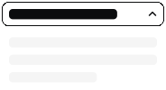
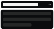
Use tiles to create visual showcase elements with a patterned background, title, and description. Tiles are ideal for displaying component previews, feature highlights, or navigation items in a grid layout.

<Tile href="/components/accordions" title="Accordion" description="Two variants">
  <img src="https://mintcdn.com/anotherhorizon/c56XyBFaIRu-DtQw/images/tiles/accordion-light.svg?fit=max&auto=format&n=c56XyBFaIRu-DtQw&q=85&s=71a371308e84711a7a709ef7ef2bdbf6" alt="Accordion component preview" className="block dark:hidden" width="184" height="100" data-path="images/tiles/accordion-light.svg" />

  <img src="https://mintcdn.com/anotherhorizon/c56XyBFaIRu-DtQw/images/tiles/accordion-dark.svg?fit=max&auto=format&n=c56XyBFaIRu-DtQw&q=85&s=8a7c551d3c533ab03f962ef1c652fed2" alt="Accordion component preview (dark mode)" className="hidden dark:block" width="184" height="100" data-path="images/tiles/accordion-dark.svg" />
</Tile>

```mdx Tile example theme={null}
<Tile href="/components/accordions" title="Accordion" description="Two variants">
  <img src="/images/tiles/accordion-light.svg" alt="Accordion component preview" className="block dark:hidden" />
  <img src="/images/tiles/accordion-dark.svg" alt="Accordion component preview (dark mode)" className="hidden dark:block" />
</Tile>
```

## Grid layout

Combine tiles with the [columns component](/components/columns) to create a responsive grid of visual previews.

<Columns cols={3}>
  <Tile href="/components/accordions" title="Accordion" description="Two variants">
    <img src="https://mintcdn.com/anotherhorizon/c56XyBFaIRu-DtQw/images/tiles/accordion-light.svg?fit=max&auto=format&n=c56XyBFaIRu-DtQw&q=85&s=71a371308e84711a7a709ef7ef2bdbf6" alt="Accordion component preview" className="block dark:hidden" width="184" height="100" data-path="images/tiles/accordion-light.svg" />

    <img src="https://mintcdn.com/anotherhorizon/c56XyBFaIRu-DtQw/images/tiles/accordion-dark.svg?fit=max&auto=format&n=c56XyBFaIRu-DtQw&q=85&s=8a7c551d3c533ab03f962ef1c652fed2" alt="Accordion component preview (dark mode)" className="hidden dark:block" width="184" height="100" data-path="images/tiles/accordion-dark.svg" />
  </Tile>

  <Tile href="/components/accordions" title="Accordion" description="Two variants">
    <img src="https://mintcdn.com/anotherhorizon/c56XyBFaIRu-DtQw/images/tiles/accordion-light.svg?fit=max&auto=format&n=c56XyBFaIRu-DtQw&q=85&s=71a371308e84711a7a709ef7ef2bdbf6" alt="Accordion component preview" className="block dark:hidden" width="184" height="100" data-path="images/tiles/accordion-light.svg" />

    <img src="https://mintcdn.com/anotherhorizon/c56XyBFaIRu-DtQw/images/tiles/accordion-dark.svg?fit=max&auto=format&n=c56XyBFaIRu-DtQw&q=85&s=8a7c551d3c533ab03f962ef1c652fed2" alt="Accordion component preview (dark mode)" className="hidden dark:block" width="184" height="100" data-path="images/tiles/accordion-dark.svg" />
  </Tile>

  <Tile href="/components/accordions" title="Accordion" description="Two variants">
    <img src="https://mintcdn.com/anotherhorizon/c56XyBFaIRu-DtQw/images/tiles/accordion-light.svg?fit=max&auto=format&n=c56XyBFaIRu-DtQw&q=85&s=71a371308e84711a7a709ef7ef2bdbf6" alt="Accordion component preview" className="block dark:hidden" width="184" height="100" data-path="images/tiles/accordion-light.svg" />

    <img src="https://mintcdn.com/anotherhorizon/c56XyBFaIRu-DtQw/images/tiles/accordion-dark.svg?fit=max&auto=format&n=c56XyBFaIRu-DtQw&q=85&s=8a7c551d3c533ab03f962ef1c652fed2" alt="Accordion component preview (dark mode)" className="hidden dark:block" width="184" height="100" data-path="images/tiles/accordion-dark.svg" />
  </Tile>
</Columns>

```mdx Grid layout example theme={null}
<Columns cols={3}>
  <Tile href="/components/accordions" title="Accordion" description="Two variants">
    <img src="/images/tiles/accordion-light.svg" alt="Accordion component preview" className="block dark:hidden" />
    <img src="/images/tiles/accordion-dark.svg" alt="Accordion component preview (dark mode)" className="hidden dark:block" />
  </Tile>
  <Tile href="/components/accordions" title="Accordion" description="Two variants">
    <img src="/images/tiles/accordion-light.svg" alt="Accordion component preview" className="block dark:hidden" />
    <img src="/images/tiles/accordion-dark.svg" alt="Accordion component preview (dark mode)" className="hidden dark:block" />
  </Tile>
  <Tile href="/components/accordions" title="Accordion" description="Two variants">
    <img src="/images/tiles/accordion-light.svg" alt="Accordion component preview" className="block dark:hidden" />
    <img src="/images/tiles/accordion-dark.svg" alt="Accordion component preview (dark mode)" className="hidden dark:block" />
  </Tile>
</Columns>
```

## Properties

<ResponseField name="href" type="string" required>
  URL to navigate to when the tile is clicked.
</ResponseField>

<ResponseField name="title" type="string">
  The title displayed below the tile preview.
</ResponseField>

<ResponseField name="description" type="string">
  A short description displayed below the title.
</ResponseField>

<ResponseField name="children" type="React.ReactNode" required>
  Content displayed inside the tile preview area, typically images or SVGs.
</ResponseField>